Data Lens - Exploring Earth's Visual Stories
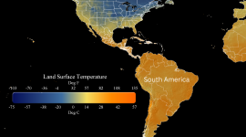
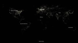
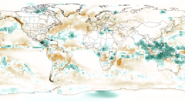
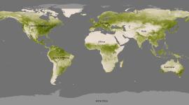
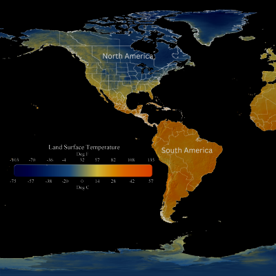
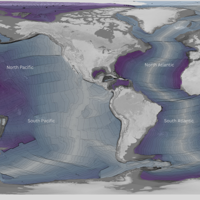
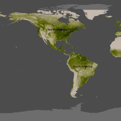
Data Lens activities equip teachers with tools to help their students engage with and understand complex scientific data. Informed by Visual Thinking Strategies, each exercise includes an art image and a timely global map that can stand alone or open a discussion about a relevant classroom unit of study. When used regularly, these activities may help to increase data literacy skills in your classroom.
Sign up to receive Data Lens directly to your email inbox. The activity remains fairly consistent week to week, making implementation easy!
View a recorded webinar demonstrating Data Lens and other visual and data literacy techniques.
Get Started for more on how and why to use Data Lens in your classroom.
If you have any questions, email hilary.peddicord@noaa.gov.




Program Team

Publications
Semmens, K., Sickler, J., Maxfield, K., Goldner, M., Curry, D., Peddicord, H., … Carr, R. H. (2024). Building Insights Through Observation: Integrating Art and Science to Support Sensemaking. Science Scope, 48(2), 30–38. https://doi.org/10.1080/08872376.2025.2463906